UIFactory Quickstart
This is a 15-minute tutorial on building web components with UIFactory. You’ll learn how to:
- Create custom web components with just HTML, CSS and JS
- Make these components re-usable and distribute them
- Integrate them in any framework like Angular, React, or Vue
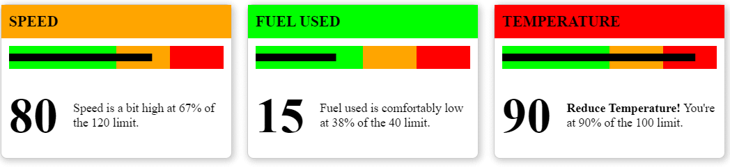
We’ll build a simple dashboard showing KPI cards that looks like this:

1. Create a CodePen
Create a CodePen by visiting https://codepen.io/pen/. Name it kpi-card.
2. Include UIFactory
Add this line to your HTML file. This links directly to UIFactory from the CDN. No need to install anything.
<script src="https://cdn.jsdelivr.net/npm/uifactory@1.24.0/dist/uifactory.min.js"></script>
3. Create a component with HTML and CSS
Anything inside <template $name="kpi-card">...</template> automatically becomes your <kpi-card> component. For example,
Create the outline of the KPI card by adding this HTML and CSS.
<!-- Create the component with HTML and CSS -->
<template $name="kpi-card">
  <style>
    kpi-card main {
      width: 300px;
      height: 200px;
      border: 1px solid rgba(0,0,0,0.2);
      border-radius: 0.5rem;
      box-shadow: 2px 2px 8px 2px rgba(0,0,0,0.2);
      margin: 0.5rem;
      display: inline-block;
    }
  </style>

  <main></main>
</template>
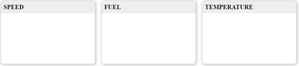
This creates a <kpi-card> component. Every time you add it to the page, it adds a block.
<!-- Use the component multiple times -->
<kpi-card></kpi-card>
<kpi-card></kpi-card>
<kpi-card></kpi-card>

4. Customize components with attributes
To customize <kpi-card> with different titles, let’s add the title= attribute to it. Replace this line:
<template $name="kpi-card">
… with this:
<template $name="kpi-card" title="Default title">
This title attribute is available as a JavaScript variable. Replace this line:
<main></main>
… with this:
  <main>
    <h1>${title}</h1>
  </main>
Now, when you add a title= to each component, it adds a new title.
<kpi-card title="Speed"></kpi-card>
<kpi-card title="Fuel"></kpi-card>
<kpi-card title="Temperature"></kpi-card>
Note: We added a little style to the heading using:
    kpi-card h1 {
      margin: 0;
      padding: 0.5rem 0.5rem;
      font-size: 125%;
      text-transform: uppercase;
      background-color: #eee;
    }
5. Components can contain components
The entire dashboard can be converted into a web component for re-use across pages.
Create a <kpi-dashboard> component by adding this:
<!-- Create the dashboard component -->
<template $name="kpi-dashboard">
  <kpi-card title="Speed"></kpi-card>
  <kpi-card title="Fuel"></kpi-card>
  <kpi-card title="Temperature"></kpi-card>
</template>
Now, use this component by adding:
<kpi-dashboard></kpi-dashboard>
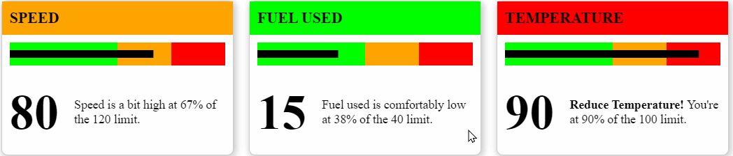
The result is identical:
6. Pass data to components
To pass JavaScript objects via attributes, we use the :js type suffix for attributes. For example, status:js="{Speed: 30, Fuel: 20, Temperature: 80}" makes status available as a JavaScript object.
Replace the <template $name="kpi-dashboard">...</template> code with:
<!-- Create the dashboard component -->
<template $name="kpi-dashboard" status:js="{Speed: 30, Fuel: 20, Temperature: 80}">
  <kpi-card title="Speed: ${status.Speed}"></kpi-card>
  <kpi-card title="Fuel: ${status.Fuel}"></kpi-card>
  <kpi-card title="Temperature: ${status.Temperature}"></kpi-card>
</template>
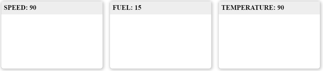
This shows the values of speed, fuel and temperature in the titles when you pass status:js="..." to <kpi-dashboard>, like this:
<kpi-dashboard status:js="{Speed: 90, Fuel: 15, Temperature: 90}"></kpi-dashboard>
7. Write templates
Apart from using ${} to insert JavaScript variables, you can use templates to write any JavaScript code.
Replace the <template $name="kpi-dashboard">...</template> code with:
<!-- Create the dashboard component -->
<template $name="kpi-dashboard" status:js="">
  <% for (let key in status) { %>
    <kpi-card title="${key}: ${status[key]}"></kpi-card>
  <% } %>
</template>
The result is identical. But instead of hard-coding speed, fuel & temperature, <kpi-dashboard> can be used for any metrics.
Note: You can add any JavaScript code inside <% ... %>.
8. Create charts
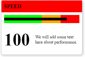
We can use templates and SVG to create charts. Let’s re-design <kpi-card> to include a chart, a value and some commentary, like this:
Here’s the code for this.
<!-- Create the component with HTML and CSS -->
<template $name="kpi-card" title="Default title" value:number="50" limit:number="100">
  <style>
    /* We'll skip the styling here. Please see CodePen for the full style */
  </style>
  <main>
    <% let percent = value / limit * 100 %>
    <h1 class="${ percent <= 50 ? 'ok' : percent <= 75 ? 'warning' : 'danger' }">${title}</h1>
    <svg width="280" height="30" style="margin: 10px">
      <rect x="0" y="0" fill="red" width="100%" height="30"></rect>
      <rect x="0" y="0" fill="orange" width="75%" height="30"></rect>
      <rect x="0" y="0" fill="lime" width="50%" height="30"></rect>
      <rect x="0" y="10" fill="#000" width="<%= percent %>%" height="10"></rect>
    </svg>
    <section>
      <h2>${value}</h2>
      <p>We will add some text here about performance.</p>
    </section>
  </main>
</template>
Let’s break this down, step-by-step:
<template $name="kpi-card" title="Default title" value:number="50" limit:number="100">lets us pass 3 attributes: title, value and limit. These 3 variables are available<% let percent = value / limit * 100 %>calculates the value as a percentage of limit. If value = 300 and limit = 1000, percent = 30.<h1 class="${ percent <= 50 ? 'ok' : percent <= 75 ? 'warning' : 'danger' }">${title}</h1>- If percent < 50, add a green
class="ok"to the heading. - If percent < 75, add an orange
class="warning"to the heading. - Else, add a red
class="danger"to the heading.
- If percent < 50, add a green
- We then add an SVG that has the outline of a bullet chart:

<rect x="0" y="10" fill="#000" width="<%= percent %>%" height="10"></rect>draws a thick black line of widthpercent%
<h2>${value}</h2>adds thevalueprominently below the chart
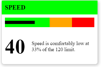
Now, we can create a full card with a title, value, chart and limit.
<kpi-card title="Speed" value="100" limit="120"></kpi-card>
9. Add narratives
Let’s add some commentary around the value.
- If it’s under 50%, we’ll say “Speed is comfortably low at xx% of the 120 limit.”
- If it’s under 75%, we’ll say “Speed is a bit high at xx% of the 120 limit.”
- Otherwise, we’ll say “Reduce Speed! You’re at xx% of the 120 limit.”
To create this, change the <p>We will add some text here about performance.</p> to:
      <p>
        <% if (percent <= 50) { %>
          ${title} is comfortably low at ${Math.round(percent)}% of the ${limit} limit.
        <% } else if (percent <= 75) { %>
          ${title} is a bit high at ${Math.round(percent)}% of the ${limit} limit.
        <% } else { %>
          <strong>Reduce ${title}!</strong> You're at ${Math.round(percent)}% of the ${limit} limit.
        <% } %>
      </p>
10. Consolidate into the dashboard
Now, let’s re-write the dashboard component to be able to accept the status like this:
<kpi-dashboard status:js="{Speed: [80, 120], 'Fuel used': [15, 40], Temperature: [90, 100]}"></kpi-dashboard>
To do that, we rewrite the component to loop through the keys in status and pass the title, limit and value attributes:
<!-- Create the dashboard component -->
<template $name="kpi-dashboard" status:js="">
  <% for (let key in status) { %>
    <kpi-card title="${key}" value="${status[key][0]}" limit="${status[key][1]}"></kpi-card>
  <% } %>
</template>
11. Make it interactive
Let’s test this component with different values. When it’s clicked, we’ll replace the numbers with a random value.
To do this, we add an event handler inside <script $onclick>...</script>, like this:
<!-- Create the dashboard component -->
<template $name="kpi-dashboard" status:js="">
  <% for (let key in status) { %>
    <kpi-card title="${key}" value="${status[key][0]}" limit="${status[key][1]}"></kpi-card>
  <% } %>
  <script $onclick>
    let v = Math.round(Math.random() * 100)
    // 'this' is the component instance. Updating an attribute re-renders it
    this.status = {Speed: [v, 120], 'Fuel used': [v, 40], Temperature: [v, 100]}
  </script>
</template>
12. Distribute components as files
These web components can be stored in a HTML file. The filename is the same as component name, by convention. This component is saved at kpi-dashboard.html.
To use it in your application, add:
<script src="https://cdn.jsdelivr.net/npm/uifactory@1.24.0/dist/uifactory.min.js" import="kpi-dashboard.html"></script>
Note the import="kpi-dashboard.html" in the 2nd line. That makes <kpi-dashboard> available to use in your page.
13. Use it with Angular or React or Vue
Frameworks like Angular, React or Vue focus on building applications.
UIFactory focuses on building components that can be used in applications.
UIFactory creates web components (also called custom elements) that work will with all web frameworks.
- Angular works well with web components with CUSTOM_ELEMENTS_SCHEMA enabled
- React works well with web components
- Vue works well with web components
Here’s an example of using <kpi-dashboard> with React.
ReactDOM.render(
  <section>
    <h1>KPI Dashboard</h1>
    <kpi-dashboard status="{Speed: [80, 120], 'Fuel used': [15, 40], Temperature: [90, 100]}"></kpi-dashboard>
  </section>,
  document.getElementById('root')
);