network-chart
<network-chart> renders a network chart (a force-directed layout) with nodes connected by links.
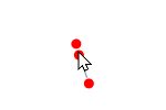
This is useful when creating force directed layouts like:
Usage
Add this code anywhere in your HTML page:
<script src="https://cdn.jsdelivr.net/npm/uifactory@1.24.0/dist/uifactory.min.js" import="@network-chart"></script>
<script>
  /* exported nodes, links */
  var nodes = [
    { id: 0 },
    { id: 1 },
    { id: 2 },
    { id: 3 },
  ]
  var links = [
    { source: 0, target: 1 },
    { source: 1, target: 2 },
    { source: 2, target: 0 },
    { source: 0, target: 3 },
  ]
</script>
<network-chart data:js="{nodes: nodes, links: links}">
  Loading network...
</network-chart>
This renders the following output:
Properties
<network-chart> has the following properties:
type: string. “node-link”data: js=”{}”width: number (optional). Chart width in pixels. Default: 500height: number (optional). Chart height in pixels. Default: 500collide: boolean (optional). If true, don’t allow nodes to overlap. If set to a number, provide a padding between nodes. Default: falsedrag-action: string (optional). Default: pinnode: boolean (optional). Show nodes?node="false"hides all nodes. Default: truenode-charge: number (optional). How strongly nodes push each other. -ve values make nodes pull each other. Default: +30link: boolean (optional). Show links?links="false"hides all links. Default: truelink-id: string (optional). TODO: document this. Default: Nonelabel: boolean (optional). Show labels?labels="false"hides all labels. Default: true
It also has properties that change the properties of nodes, links and labels:
node-size: number (optional). Radius of node circles in pixels. Default: 5node-fill: color (optional). Color of the node circles. Default: rednode-opacity: number (optional). Use 0.0 for transparent nodes, 1.0 for opaque nodes. Default: 1node-stroke: color (optional). Outline color of the node circles. Default: #fffnode-stroke-width: number (optional). Thickness of the node circles in pixels. Default: 1link-stroke: color (optional). Line color of the links. Default: #999link-stroke-width: number (optional). Thickness of the links in pixels. Default: 1link-opacity: number (optional). Use 0.0 for transparent links, 1.0 for opaque links. Default: 0.6link-distance: number (optional). Default distance between nodes. Default: 30label-text: string (optional). Text to show in label. Default: Nonelabel-text-anchor: string (optional).startfor left aligned,endfor right-aligned,middlefor centered. Default: middlelabel-dominant-baseline: string (optional).hangingfor top aligned,alphabeticfor bottom-aligned,middlefor centered. Default: middlelabel-font-family: string (optional). Label font name, e.g.Roboto. Default: sans-seriflabel-font-size: number (optional). Label font size in pixels. Default: 12label-font-weight: string (optional). Label font weight, e.g. “bold” or “”. Default: boldlabel-fill: color (optional). Label font color. Default: blacklabel-dx: number (optional). Shift label right in pixels. -ve values to shift left. Default: 0label-dy: number (optional). Shift label down in pixels. -ve values to shift up. Default: 0
These node/link/label properties can be functions that accept the node/link/node data object. For example:
node-fill:js="d => d.age < 18 ? 'red' : 'green'"fills nodes red if.ageis under 18, else greenlink-opacity:js="d => d.count > 4 ? 1 : 0"makes links with.countunder 4 transparent, rest are shown
Changing any property re-renders the component. For example:
// Re-render the network with green nodes
document.querySelector('network-chart').nodeFill = 'green'