UIFactory Guide
Table of contents
- UIFactory Guide
- Install from a CDN or npm
<template $name="...">creates components as HTML templates<script import="file.html">loads components from files<script $inline>runs scripts while rendering- Lodash templates are supported
<template attr="...">defines properties<template attr:type="...">defines property typesattr:=adds dynamic attributes, classes and styles<slot>inserts contents from the instance<script type="text/html" $block="...">creates re-usable blocks.update()update or or more propertiesthisis the instance DOM element<style>components with CSS<link>to external stylesheets<script $on...>adds events<script $onrender>and other lifecycle events are supported
- Advanced options
<script type="text/html">supports tables and invalid HTMLthis.$data[property]stores all propertiesthis.$idhold a unique ID for each componentthis.$contentshas component’s original DOM<script>tags are moved to document’s body- Insert components dynamically
attr:type=on an instance adds new propertiesuifactory.register()registers new componentsuifactory.typeslets you add custom types.$ready.then()when instance is first rendereduifactory.componentslists registered components$rendersupports any renderercompile:supports any compiler
- Reference
Install from a CDN or npm
You can use UIFactory directly from the CDN:
<script src="https://cdn.jsdelivr.net/npm/uifactory@1.24.0/dist/uifactory.min.js"></script>
Or you can use npm to install UIFactory locally:
npm install uifactory
… and include it in your HTML file with:
<script src="node_modules/uifactory/dist/uifactory.min.js"></script>
<template $name="..."> creates components as HTML templates
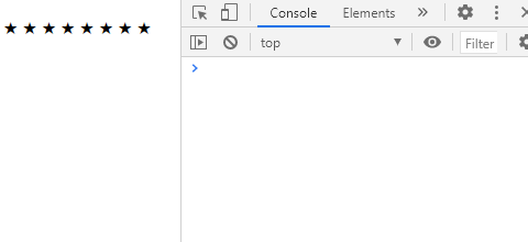
To create this <repeat-html> component, add a <template $name="repeat-html"> like this:
<template $name="repeat-html" icon="X" value="30">
  ${icon.repeat(+value)}
</template>
When you add the component to your page:
<repeat-html icon="★" value="8"></repeat-html>
… it renders this output:

You can use template literals inside the <template> to generate the HTML.
NOTE:
- You MUST have a dash (hyphen) in the component name (e.g.
repeat-html). It’s a standard. - If the
<template>is empty, the instance’s contents are used as the template. - You cannot use
}inside the template literal expression.${ {x: 1} }is invalid. Keep template literals simple
<script import="file.html"> loads components from files
You can save components in a HTML file. For example, this tag.html defines 2 components: <tag-a> and <tag-b>.
<template $name="tag-a">This is tag-a</template>
<template $name="tag-b">This is tag-b</template>
To use <tag-a> and <tag-b> in your HTML file, import it with import=:
<script src="//cdn.jsdelivr.net/npm/uifactory" import="tag.html"></script>
Load multiple files separated by comma and/or spaces. Relative and absolute URLs both work.
<script src="https://cdn.jsdelivr.net/npm/uifactory" import="
  tag.html, tag2.html, ../test/tag3.html
  https://cdn.jsdelivr.net/npm/uifactory/test/tag4.html
"></script>
To import pre-built components, use import="@component-name":
<script src="//cdn.jsdelivr.net/npm/uifactory" import="@svg-chart @md-text"></script>
Or, if you already loaded UIFactory, use:
<script>
uifactory.register('tag5.html')
</script>
Note:
- This uses fetch. The fetched files must be in the same domain or CORS-enabled.
<script $inline> runs scripts while rendering
To add logic to your component, add any JavaScript inside <script $inline>. This runs when the component is rendered.
<template $name="repeat-script" icon="X" value="30">
  <script $inline>
    let count = +value
    let result = isNaN(count) ? 'error' : icon.repeat(count)
  </script>
  ${result}
</template>
When you add the component to your page:
<repeat-script icon="★" value="8"></repeat-html>
<repeat-script icon="★" value="a"></repeat-html>
… it renders this output:
★★★★★★★★ error
Note:
- Add
returnanywhere in the script to stop rendering a component. (Set{parserOptions: {ecmaFeatures: {globalReturn: true}}to avoid ESLint errors.)
Lodash templates are supported
For better control, you can use Lodash templates like this:
<template $name="repeat-template" value="30" icon="★">
  <% for (var j=0; j < +value; j++) { %>
    <%= icon %>
  <% } %>
</template>
When you add the component to your page:
<repeat-template value="8" icon="★"></repeat-template>
… it renders this output:
.
There are 3 kinds of template tags you can use:
<% ... %>evaluates JavaScript. e.g.,<% console.log('ok') %>logsok. This is like<script $inline>but more compact<%= ... %>renders JavaScript. e.g.,<%= `<b>${2 + 3}</b>` %>renders 5 in bold. This is like${...}but allows}inside it<%- ... %>renders JavaScript, HTML-escaped. e.g.,<%- `<b>${2 + 3}</b>` %>renders<b>5</b>instead of a bold 5
<template attr="..."> defines properties
Attributes added to <template> can be accessed as properties. For example, this defines 2 attributes, icon= and value=:
<template $name="repeat-icon" icon="★" value="30">
  ${icon.repeat(+value)}
</template>
Now, you can use el.icon and el.value to get and set these attributes.
<script>
let el = document.querySelector('repeat-icon')  // Find first <repeat-icon>
console.log(el.icon)                            // Logs ★
console.log(el.value)                           // Logs 30
el.value = 10                                   // Renders ★★★★★★★★★
</script>
Setting a property, e.g. .value = ... re-renders the component. So does .setAttribute('value', ...).
NOTE:
- Inside templates, properties are available as JavaScript variables (e.g.
.iconor.value) - Attributes with uppercase letters (e.g.
fontSize) are converted to lowercase properties (e.g.fontsize) - Attributes with a dash/hyphen (e.g.
font-size) are converted to camelCase properties (e.g.fontSize). - Attributes not in the template are NOT properties, even if you add them in the component (e.g.
<my-component extra="x">does not define a.extra). - But attributes with types (e.g.
extra:string="x") are available as properties. - Properties that cannot be variable names (e.g.
default="") can be accessed viathis.$data(e.g.this.$data['default']).
<template attr:type="..."> defines property types
By default, properties are of type string. You can specify number, boolean, array, object or js like this:
<template $name="..." num:number="30"><template $name="..." bool:boolean="true"><template $name="..." arr:array="[3,4]"><template $name="..." obj:object='{"x":1}'><template $name="..." expr:js="Math.ceil(2.2) + num">
The value for :js= can include global variables as well as other properties defined just before this property.
For example, when you add this to your page:
<template $name="property-types" x="" str:string="" num:number="" bool:boolean=""
  arr:array="" obj:object="" expr:js="" rules:js="">
  ${JSON.stringify({x, str, num, bool, arr, obj, expr, rules})}
</template>
<script>
  var rules = {r: 1}
</script>
<property-types x="x" str="y" num="30" bool="true" arr="[3,4]" obj='{"x":1}'
  expr="Math.ceil(2.2) + num + data.num" rules="rules"></property-types>
… it renders this output:
{"x":"x","str":"y","num":30,"bool":true,"arr":[3,4],"obj":{"x":1},"expr":63,"rules":{"r":1}}
attr:= adds dynamic attributes, classes and styles
To set attribute values dynamically, use := instead of = and assign any string or boolean expression:
disabled:="true"becomes “disabled”disabled:="false"does not add the disabled attributetype:="isNumeric ? 'number' : 'text'"setstype="number"if isNumeric is truthy, elsetype="text"
For dynamic classes, set the class:= attribute to a array, object, or string:
class:="['x', 'y']"becomesclass="x y"class:="{x: true, y: false}"becomesclass="x"class:="['x', {y: true, z: false}]"becomesclass="x y"class:="${active ? 'yes' : 'no'}"becomesclass="yes"is active is true, elseclass="no"
For dynamic styles, set the style:= attribute to an object or string:
style:="{'font-size': `${size}px`, color: 'red'}"becomesstyle="font-size:20px;color:red"(when size=20).style:="font-size="${size}px; color: red"also becomesstyle="font-size:20px;color:red"(when size=20).
For example, this defines an <add-class> component:
<template $name="custom-input" disabled:boolean="true" type:string="text" min:number="0">
  <style>
    .round { border-radius: 20px; }
    .active { border: 1px solid red; }
  </style>
  <input
    disabled:="disabled"
    type:="type"
    min:="min"
    class:="['round', {active: !disabled}]"
    style:="{'background-color': disabled ? 'white' : 'lightblue'}"
  >
</template>
When you add this to your page:
Active: <custom-input disabled="false" type="number" min="0"></custom-input>
Inactive: <custom-input disabled="true"></custom-input>
… it renders:

<slot> inserts contents from the instance
Slots let you create components in which component users can change content.
For example, this defines a component with 2 slots:
<template $name="slot-translate">
   Good = <slot name="good">...</slot>.
   Bad = <slot name="bad">...</slot>.
</template>
When you add the component to your page:
<slot-translate>
  <span slot="good"><em>bon</em></span>
  <span slot="bad"><strong>mauvais</strong></span>
</slot-translate>
… it renders this output:
Good = bon. Bad = mauvais.
<slot name="good">is replaced with allslot="good"elements.<slot name="bad">is replaced with allslot="bad"elements.<slot>(withoutname=) is replaced with the whole<slot-translate>contents.
Slots can contain variables like ${x}. This lets component users customize the component further.
Slot contents are also available as this.$slot[slotName]. ${this.$slot.good} is just like <slot name="good"></slot>.
<script type="text/html" $block="..."> creates re-usable blocks
To re-use HTML later, add it into a <script type="text/html" $block="blockname">...</script>. For example:
<template $name="block-example" greeting="hello">
  <script type="text/html" $block="one">one says ${greeting}.</script>
  <script type="text/html" $block="two">two says ${greeting}.</script>
  <%= one() %>
  <%= two({ greeting: 'Ola' }) %>
</template>
When you add the component to your page:
<block-example></block-example>
… it renders this output:
one says hello. two says Ola.
Note:
- You can use
thisand all properties as variables. - If multiple
<script type="text/html">have the same$blockvalue, the last one is used
.update() update or or more properties
You can change multiple properties together using .update({'attr-1': val, 'attr-2': val}). For example, this component has 2 properties, char and repeat-value:
<template $name="repeat-props" char="★" repeat-value:number="10">
  ${char.repeat(repeatValue)}
</template>
<repeat-props char="★" repeat-value="10"></repeat-props>
After the element is rendered, run this code in your JavaScript console:
document.querySelector('repeat-props').update({
  char: '⚡',
  'repeat-value': 8       // Note: use 'repeat-value', not repeatValue
})
This updates both char and repeat-value to generate this output:

.update() also updates the attributes and re-renders the component. .update() takes a second object as options:
attr: falsedoes not update the attribute. Default:truerender: falsedoes not re-render the component. Default:true
For example, this updates the properties without changing the attributes and without re-rendering.
document.querySelector('repeat-props').update({
  char: '⚽',
  'repeat-value': 5
}, { attr: false, render: false })
To re-render the component without changing properties, use .update().
document.querySelector('repeat-props').update()
this is the instance DOM element
Inside the template, this refers to the component itself.
For example, this component makes its parent’s background yellow.
<template $name="parent-background" color="yellow">
  <% this.parentElement.style.background = color %>
</template>
When you add the component to your page:
<div>
  <parent-background></parent-background>
  This has a yellow background
</div>
… it renders this output:

This lets you control not just the component, but parents, siblings, and any other elements on a page.
<style> components with CSS
Use regular CSS in the <style> tag to style components. For example:
<template $name="repeat-style" value:number="30">
  <style>
    /* If class="highlight", add a yellow background */
    repeat-style.highlight { background-color: yellow; }
    /* Color all bold items green INSIDE THE COMPONENT */
    b { color: green; }
  </style>
  <% for (var j=0; j < value; j++) { %>
    <slot></slot>
  <% } %>
</template>
When you add the component to your page:
<repeat-style class="highlight" value="8">
  <b>★</b>
</repeat-style>
… it renders this output:

You can’t pollute styles outside the component. UIFactory adds the component name before every selector (if it’s missing). For example:
repeat-style.highlight {...}stays as-is – it already hasrepeat-style.highlight b {...}becomesrepeat-style .highlight b {...}b { color: green}becomesrepeat-style b { color:green; }
So any <b> outside the component does not change color.
Note: This isn’t foolproof. It’s simply to prevent accidental pollution.
You can override component styles from the outside. UIFactory just copies the <style> into the document – no shadow DOM. Adding this <style> overrides the component color:
<style>
/* Prefixing `body` to `repeat-stye b` for more specificity */
body repeat-style b { color: red; }
</style>

<link> to external stylesheets
You can link to external stylesheets. For example, this imports Bootstrap 4.6.
<template $name="bootstrap-button" type="primary">
  <link rel="stylesheet" href="https://cdn.jsdelivr.net/npm/bootstrap@4.6.0/dist/css/bootstrap.min.css">
  <button class="btn btn-${type} m-3"><slot></slot></button>
</template>
When you add the component to your page:
<bootstrap-button type="success">★</bootstrap-button>
… it renders this output:

All <style>s and <link rel="stylesheet">s are copied from the <template> and appended to the document’s <head>. They run only once (even if you use the component multiple times.)
<script $on...> adds events
To add an click event listener to your component, write the code inside a <script $onclick>...</script>, like this:
<template $name="count-items" count:number="0" step:number="2">
  Click to count ${count} items in steps of ${step}.
  <script $onclick>
    this.count += step
  </script>
</template>
When you add the component to your page:
<count-items></count-items>
… it renders this output:

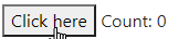
To add a click event listener to a child, use <script $onclick="child-selector">...</script>:
<template $name="count-button" count:number="0" step:number="2">
  <button>Click here</button>
  <span>Count: ${count}</span>
  <script $onclick="button">
    this.count += step
  </script>
</template>
Now, <count-button></count-button> renders:
Listeners can use these variables:
eis the event objectthisis the component instance- Any property, e.g.
count,step
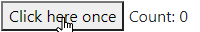
To call the listener only once, add the $once attribute to <script>:
<template $name="count-once" count:number="0" step:number="2">
  <button>Click here once</button>
  <span>Count: ${count}</span>
  <script $onclick="button" $once>
    this.count += step
  </script>
</template>
Now, <count-once></count-once> renders:
<script $onrender> and other lifecycle events are supported
Components fire these events at different stages of their lifecycle:
preconnect: before the instance is created and properties are definedconnect: after the instance is created and properties are defineddisconnect: after the element is disconnected from the DOMprerender: before the instance is renderedrender: after the instance is rendered
Add <script $onpreconnect>...</script>, <script $onrender>...</script>, etc to create listeners. For example:
<template $name="repeat-events" icon="★" value:number="1">
  <script $onrender>
    this.innerHTML = icon.repeat(value)
  </script>
</template>
Now, <repeat-events icon="★" value="8"><repeat-events> renders this output:
NOTE:
<script $onrender $once>creates a listener that runs only on the first render<script $onrender $onclick=".reload">runs the listener both on render AND click ofclass="reload"- Multiple
<script $onrender>...</script>creates multiple listeners this.addEventListener('render', ...)is exactly the same as<script $onrender>
Advanced options
<script type="text/html"> supports tables and invalid HTML
HTML doesn’t allow <% for ... %> inside a <tbody>. (Only <tr> is allowed.) So this is invalid:
<template $name="table-invalid" rows="3">
  <table>
    <tbody>
      <% for (let i=0; i < +rows; i++) { %>
        <tr><td>Row ${i}</td></tr>
      <% } %>
    </tbody>
  </table>
</template>
To avoid this, wrap tables inside a <script type="text/html">...</script>. Anything inside it is rendered as a template. (Any HTML outside it is ignored.)
<template $name="table-valid" rows="0">
  This text is ignored!
  <script type="text/html">
    <table>
      <tbody>
        <% for (let i=0; i < +rows; i++) { %>
          <tr><td>Row ${i}</td></tr>
        <% } %>
      </tbody>
    </table>
  </script>
  This text is ignored too!
</template>
<table-valid rows="3"></table-valid>
It renders this output:

this.$data[property] stores all properties
All properties are stored in this.$data as an object. You can read and write these values. For example, this <print-default> component changes the default attribute before rendering:
<template $name="print-default" default="old">
  <script $onprerender>
    console.log(this.$data)     // Prints { "default": "old" }
    this.$data.default = 'new'  // Updates default value
  </script>
  ${this.$data.default}
</template>
Normally, properties are ALSO accessible as this.<attributeName>. But if you define a <template query-selector="xx">, will this.querySelector be “xx” or the this.querySelector() function?
ANS: this.querySelector is the function. this.$data.querySelector holds “xx”.
This is be useful if you don’t know whether a property is defined or not. For example, when you add this to your page:
<template $name="obj-values" x:number="0" y:number="0">
  Properties:
    <% for (let key in this.$data) { %>
      ${key}=${this.$data[key]}
    <% } %>
  z=${'z' in this.$data ? 'defined' : 'undefined'}
</template>
<obj-values x="10" y="20"></obj-values>
… it renders this output:
Properties: x=10 y=20 z=undefined
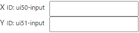
this.$id hold a unique ID for each component
If you generate an id= attribute in your component, you need a unique identifier for each component. this.$id has a string that’s unique for each component instance.
For example, this creates a label-input combination with a unique ID for each input:
<template $name="label-input" type="text" label="">
  <div style="display: flex; gap: 10px">
    <label for="${this.$id}-input">${label} <small>ID: ${this.$id}-input</small></label>
    <input id="${this.$id}-input" type="${type}">
  </div>
</template>
Now, if you repeatedly use this component in a page:
<label-input label="X"></label-input>
<label-input label="Y"></label-input>
… it creates elements with different IDs:
this.$contents has component’s original DOM
this.$contents is a cloned version of the custom element’s original DOM. You can access what the user specified inside your component and use it.
For example, <repeat-icons> repeats everything under class="x" x times, and everything under class="y" y times.
<template $name="repeat-icons" x:number="3" y:number="2">
  ${this.$contents.querySelector('.x').innerHTML.repeat(x)}
  ${this.$contents.querySelector('.y').innerHTML.repeat(y)}
</template>
<repeat-icons x="5" y="4">
  <span class="x">🙂</span>
  <span class="y">😡</span>
</repeat-icons>
… it renders this output:
🙂🙂🙂🙂🙂😡😡😡😡
<script> tags are moved to document’s body
Use regular JavaScript to add logic and interactivity.
<template $name="text-diff" x="" y="">
  "${x}" is ${uifactory.textDiff.distance(x, y)} steps from "${y}"
  <script src="https://cdn.jsdelivr.net/npm/levenshtein@1.0.5/lib/levenshtein.js"></script>
  <script>
    // By convention, we add any JS related to a component under uifactory.<componentName>
    uifactory.textDiff = {
      distance: (x, y) => (new Levenshtein(x, y)).distance
    }
  </script>
</template>
When you add the component to your page:
<text-diff x="back" y="book"></text-diff>
… it renders this output:
"back" is 2 steps from "book"
All <script>s are copied from the <template> and appended to the document’s BODY in order. They run only once (even if you use the component multiple times.)
Insert components dynamically
You can dynamically insert components into the page. For example:
<div id="parent1"></div>
<template $name="navigator-property" value="onLine">${value} = ${navigator[value]}</template>
<script>
  document.querySelector('#parent1').innerHTML = '<navigator-property><navigator-property>'
</script>
… adds a <navigator-property> dynamically into the <div id="parent1">, and renders this output:
onLine = true
This code does the same thing:
<div id="parent2"></div>
<script>
  let el = document.createElement('navigator-property')
  el.setAttribute('value', 'onLine')  // optional
  document.querySelector('#parent2').appendChild(el)
</script>
attr:type= on an instance adds new properties
You can defining properties on templates. But you can add properties on an instance too.
For example, if you have a <base-component> with a base or root attributes like this:
<template $name="base-component" base:number="10" root="">
  Instance properties:
  <% for (let key in this.$data) { %>
    ${key}=${this.$data[key]}
  <% } %>
</template>
… you can add a custom property when creating the element, by adding a type (e.g. :number) like this:
<base-component child:number="20"></base-component>
This will render:
Instance properties: base=10 root= child=20
The child JavaScript variable is now available (as a number).
You can update instance property .child=... or the attribute child:number=
<script>
  document.querySelector('base-component').child = 30   // Redraw with child=30
  document.querySelector('base-component').setAttribute('child:number', '40')
</script>
The instance types override the template. For example, here, base and root are defined as :js, which overrides the template’s base:number:
<base-component child:number="20" base:js="1 + 2" root:js="2 + 3"></base-component>
This will render:
Instance properties: base=3 src=5 child=20
uifactory.register() registers new components
To register a component with full control over the options, use:
<repeat-options value="8"></repeat-options>
<script>
// NOTE: Add this AFTER the component is defined, not before. Else <slot> contents won't be defined
// See https://github.com/WICG/webcomponents/issues/551
uifactory.register({
  name: 'repeat-options',
  template: '<% for (var j=0; j<+value; j++) { %><slot></slot><% } %>',
  properties: {
    value: { value: "30", type: "number" }
  }
})
</script>
The object has these keys:
name: component name, e.g."g-repeat"template: component contents as a templateproperties: OPTIONAL: mapping of properties asname: {value, type}property definitionswindow: OPTIONAL: the Window on which to register the component. Used to define components on other windows or IFramescompile: OPTIONAL: the template compiler function to use
uifactory.types lets you add custom types
We define property types on attributes like this: attr:type="value". The default types are string (default), number, boolean, array, object or js.
You can add a new custom type by extending uifactory.types. For example:
uifactory.types.newtype = {
  parse: string => ...,         // Function to convert string to value
  stringify: value => ...       // Function to convert value to string
}
Each custom type needs a parse and stringify functions with the following signature:
parse(string, name, data): Converts the attributename:type="string"into the propertyel.$data.namestring: string value of the attributename: name of the attribute. (Property names are in camelCase. This is in kebab-case)data: all properties of the component, computed so far
stringify(value, name, data): Converts the propertyel.$data.name == valueinto a attribute value stringvalue: JavaScript object holding the property valuename: name of the attribute. (Property names are in camelCase. This is in kebab-case)data: all properties of the component, computed so far
It can be quite useful to have all properties available as data. This lets you parse attributes based on previous attributes.
Let’s add type called :range, which creates an array of values:
uifactory.types.range = {
  // Parse a string like seq:range="0,10,2" into [0, 2, 4, 6, 8]
  parse: string => {
    // Pick start, step, end as the first 3 numbers in the string
    let [start, end, step] = string.split(/\D+/)
    // Convert it into an array
    let result = []
    for (let val = (+start || 0); val < (+end || 1); val += (+step || 1))
      result.push(val)
    return result
  },
  // Stringify an array like [0, 2, 4, 6, 8] into "0,10,2"
  stringify: value => {
    let start = value[0]                      // First value, e.g. 0
    let step = value[1] - value[0]            // 2nd - 1st value, e.g. 2
    let end = value[value.length - 1] + step  // Last value + step, e.g. 8 + 2 = 10
    return `${start},${end},${step}`
  }
}
When you add a component using this custom type to your page:
<template $name="custom-range" series:range="">
  Values are ${JSON.stringify(series)}
</template>
<custom-range series="0,10,2"></custom-range>
… it renders this output:
Values are [0,2,4,6,8]
Let’s create a :formula type that executes JavaScript. For example:
uifactory.types.formula = {
  // Compile string into a JavaScript function, call it with data, return the result
  parse: (string, name, data) => {
    let fn = new Function('data', `with (data) { return (${string}) }`)
    return fn(data)
  },
  // Convert the value into a JSON string
  stringify: value => JSON.stringify(value)
}
When you add a component using this custom type to your page:
<template $name="custom-formula" x:number="0">x=${x}, y=${y}, z=${z}</template>
<custom-formula x="10" y:formula="x * x" z:formula="2 * y + x"></custom-formula>
… it renders this output:
x=10, y=100, z=210
The :formula type evaluates values in the context of previous values.
.$ready.then() when instance is first rendered
You can check if a component is ready (i.e. rendered for the first time), using the .$ready Promise. For example, this component uses an external script. It may time to get read.
<template $name="text-diff2" x="" y="">
  ${x} is <strong>${uifactory.textDiff2.distance(x, y)} steps</strong> from ${y}
  <script src="https://cdn.jsdelivr.net/npm/levenshtein@1.0.5/lib/levenshtein.js"></script>
  <script>
    // By convention, we add any JS related to a component under uifactory.<componentName>
    uifactory.textDiff2 = {
      distance: (x, y) => (new Levenshtein(x, y)).distance
    }
  </script>
</template>

<text-diff2 x="back" y="book"></text-diff>
When check if it has been ready, use:
  let el = await document.querySelector('text-diff2').$ready
  // The <strong> child will be present only after the component is ready.
  el.querySelector('strong').style.color = 'red'
It turns the <strong> element red when it’s ready:

uifactory.components lists registered components
If you register a <ui-config> component, uifactory.components['ui-config'] has the component’s configuration, i.e. its name, properties, template, and any other options used to register the component.
For example, this component renders its own configuration.
<template $name="ui-config" str="x" arr:array="[3,4]" expr:js="3 + 2">
  ${JSON.stringify(uifactory.components['ui-config'])}
</template>
When you add the component to your page:
<ui-config></ui-config>
… it renders this output:
{
  "name": "ui-config",
  "properties": {
    "str": {
      "type": "string",
      "value": "x"
    },
    "arr": {
      "type": "array",
      "value": "[3,4]"
    },
    "expr": {
      "type": "js",
      "value": "3 + 2"
    }
  },
  "template": "\n ${JSON.stringify(uifactory.components['ui-config'])}\n"
}
$render supports any renderer
Gramex renders the generated HTML into a node by setting node.innerHTML = html. This removes all existing DOM elements and creates new ones.
This is not good if you have event handlers, or want animations. For example, if you want to rescale a chart’s axis smoothly without re-drawing.
You can instead specify a custom $render:js="myfunction" where myfunction(node, html) updates the node in any way.
For example, here’s an SVG component that smoothly animates when an attribute changes:
<template $name="move-circle" x="0" $render:js="uifactory.moveCircle">
  <svg width="400" height="100" fill="#eee">
    <circle cx="${x}" cy="50" r="30" fill="red"></circle>
  </svg>
  <style>
    move-circle circle {
      transition: all 0.5s ease;
    }
  </style>
  <script>
    // Define a moveCircle function that accepts node as the first parameter.
    // It's called whenever the component is created or updated
    uifactory.moveCircle = function (node, html) {
      let circle = node.querySelector('circle')
      // The first time, it has no child circle. So set the HTML
      if (!circle)
        node.innerHTML = html
      // After that, don't redraw. Update the circle
      else
        node.querySelector('circle').setAttribute('cx', node.$data.x)
    }
  </script>
</template>
<move-circle x="100"></move-circle>
Now, suppose you change the circle’s color programmatically and then change the x="" attribute:
<script>
  document.querySelector('move-circle circle').setAttribute('fill', 'blue')
  document.querySelector('move-circle circle').setAttribute('x', '200')
</script>
… the circle is not redrawn. It stays blue. It smoothly moves to x="200".
compile: supports any compiler
Instead of templates, you can use any function to compile templates.
For example, the g-name component below uses Handlebars templates to render the last name in bold:
<g-name first="Walt" last="Disney">
<script src="https://cdn.jsdelivr.net/npm/handlebars@latest/dist/handlebars.js"></script>
<script>
uifactory.register({
name: 'g-name',
properties: {first: 'string', last: 'string'},
template: 'content
<!DOCTYPE html>
<html lang="en-US">
<head>
<meta charset="UTF-8">
<meta http-equiv="X-UA-Compatible" content="IE=Edge">
<title>svg-chart - UIFactory</title>
<link rel="shortcut icon" href="/favicon.ico" type="image/x-icon">
<link rel="stylesheet" href="/assets/css/just-the-docs-default.css">
<script type="text/javascript" src="/assets/js/vendor/lunr.min.js"></script>
<script type="text/javascript" src="/assets/js/just-the-docs.js"></script>
<meta name="viewport" content="width=device-width, initial-scale=1">
<!-- Begin Jekyll SEO tag v2.8.0 -->
<title>svg-chart | UIFactory</title>
<meta name="generator" content="Jekyll v3.9.2" />
<meta property="og:title" content="svg-chart" />
<meta property="og:locale" content="en_US" />
<meta name="description" content="UIFactory is a small, elegant web component framework" />
<meta property="og:description" content="UIFactory is a small, elegant web component framework" />
<link rel="canonical" href="https://uifactory.gramener.com/svg-chart/" />
<meta property="og:url" content="https://uifactory.gramener.com/svg-chart/" />
<meta property="og:site_name" content="UIFactory" />
<meta property="og:type" content="website" />
<meta name="twitter:card" content="summary" />
<meta property="twitter:title" content="svg-chart" />
<script type="application/ld+json">
{"@context":"https://schema.org","@type":"WebPage","description":"UIFactory is a small, elegant web component framework","headline":"svg-chart","url":"https://uifactory.gramener.com/svg-chart/"}</script>
<!-- End Jekyll SEO tag -->
</head>
<body>
<svg xmlns="http://www.w3.org/2000/svg" style="display: none;">
<symbol id="svg-link" viewBox="0 0 24 24">
<title>Link</title>
<svg xmlns="http://www.w3.org/2000/svg" width="24" height="24" viewBox="0 0 24 24" fill="none" stroke="currentColor" stroke-width="2" stroke-linecap="round" stroke-linejoin="round" class="feather feather-link">
<path d="M10 13a5 5 0 0 0 7.54.54l3-3a5 5 0 0 0-7.07-7.07l-1.72 1.71"></path><path d="M14 11a5 5 0 0 0-7.54-.54l-3 3a5 5 0 0 0 7.07 7.07l1.71-1.71"></path>
</svg>
</symbol>
<symbol id="svg-search" viewBox="0 0 24 24">
<title>Search</title>
<svg xmlns="http://www.w3.org/2000/svg" width="24" height="24" viewBox="0 0 24 24" fill="none" stroke="currentColor" stroke-width="2" stroke-linecap="round" stroke-linejoin="round" class="feather feather-search">
<circle cx="11" cy="11" r="8"></circle><line x1="21" y1="21" x2="16.65" y2="16.65"></line>
</svg>
</symbol>
<symbol id="svg-menu" viewBox="0 0 24 24">
<title>Menu</title>
<svg xmlns="http://www.w3.org/2000/svg" width="24" height="24" viewBox="0 0 24 24" fill="none" stroke="currentColor" stroke-width="2" stroke-linecap="round" stroke-linejoin="round" class="feather feather-menu">
<line x1="3" y1="12" x2="21" y2="12"></line><line x1="3" y1="6" x2="21" y2="6"></line><line x1="3" y1="18" x2="21" y2="18"></line>
</svg>
</symbol>
<symbol id="svg-arrow-right" viewBox="0 0 24 24">
<title>Expand</title>
<svg xmlns="http://www.w3.org/2000/svg" width="24" height="24" viewBox="0 0 24 24" fill="none" stroke="currentColor" stroke-width="2" stroke-linecap="round" stroke-linejoin="round" class="feather feather-chevron-right">
<polyline points="9 18 15 12 9 6"></polyline>
</svg>
</symbol>
<symbol id="svg-doc" viewBox="0 0 24 24">
<title>Document</title>
<svg xmlns="http://www.w3.org/2000/svg" width="24" height="24" viewBox="0 0 24 24" fill="none" stroke="currentColor" stroke-width="2" stroke-linecap="round" stroke-linejoin="round" class="feather feather-file">
<path d="M13 2H6a2 2 0 0 0-2 2v16a2 2 0 0 0 2 2h12a2 2 0 0 0 2-2V9z"></path><polyline points="13 2 13 9 20 9"></polyline>
</svg>
</symbol>
<!-- Feather. MIT License: https://github.com/feathericons/feather/blob/master/LICENSE -->
<symbol id="svg-external-link" width="24" height="24" viewBox="0 0 24 24" fill="none" stroke="currentColor" stroke-width="2" stroke-linecap="round" stroke-linejoin="round" class="feather feather-external-link">
<title id="svg-external-link-title">(external link)</title>
<path d="M18 13v6a2 2 0 0 1-2 2H5a2 2 0 0 1-2-2V8a2 2 0 0 1 2-2h6"></path><polyline points="15 3 21 3 21 9"></polyline><line x1="10" y1="14" x2="21" y2="3"></line>
</symbol>
</svg>
<div class="side-bar">
<div class="site-header">
<a href="/" class="site-title lh-tight">
UIFactory
</a>
<a href="#" id="menu-button" class="site-button">
<svg viewBox="0 0 24 24" class="icon"><use xlink:href="#svg-menu"></use></svg>
</a>
</div>
<nav role="navigation" aria-label="Main" id="site-nav" class="site-nav">
<ul class="nav-list"><li class="nav-list-item"><a href="/" class="nav-list-link">UIFactory</a></li><li class="nav-list-item"><a href="/quickstart/" class="nav-list-link">UIFactory Quickstart</a></li><li class="nav-list-item"><a href="/guide/" class="nav-list-link">UIFactory Guide</a></li><li class="nav-list-item active"><a href="#" class="nav-list-expander"><svg viewBox="0 0 24 24"><use xlink:href="#svg-arrow-right"></use></svg></a><a href="/components/" class="nav-list-link">Components</a><ul class="nav-list "><li class="nav-list-item "><a href="/comic-gen/" class="nav-list-link">comic-gen</a></li><li class="nav-list-item "><a href="/md-text/" class="nav-list-link">md-text</a></li><li class="nav-list-item "><a href="/network-chart/" class="nav-list-link">network-chart</a></li><li class="nav-list-item active"><a href="/svg-chart/" class="nav-list-link active">svg-chart</a></li><li class="nav-list-item "><a href="/vega-chart/" class="nav-list-link">vega-chart</a></li></ul></li></ul>
</nav>
<footer class="site-footer">
This site uses <a href="https://github.com/just-the-docs/just-the-docs">Just the Docs</a>, a documentation theme for Jekyll.
</footer>
</div>
<div class="main" id="top">
<div id="main-header" class="main-header">
<div class="search">
<div class="search-input-wrap">
<input type="text" id="search-input" class="search-input" tabindex="0" placeholder="Search UIFactory" aria-label="Search UIFactory" autocomplete="off">
<label for="search-input" class="search-label"><svg viewBox="0 0 24 24" class="search-icon"><use xlink:href="#svg-search"></use></svg></label>
</div>
<div id="search-results" class="search-results"></div>
</div>
<nav aria-label="Auxiliary" class="aux-nav">
<ul class="aux-nav-list">
<li class="aux-nav-list-item">
<a href="https://github.com/gramener/uifactory" class="site-button"
>
UIFactory on GitHub
</a>
</li>
</ul>
</nav>
</div>
<div id="main-content-wrap" class="main-content-wrap">
<nav aria-label="Breadcrumb" class="breadcrumb-nav">
<ol class="breadcrumb-nav-list">
<li class="breadcrumb-nav-list-item"><a href="/components/">Components</a></li>
<li class="breadcrumb-nav-list-item"><span>svg-chart</span></li>
</ol>
</nav>
<div id="main-content" class="main-content" role="main">
<h1 id="svg-chart">
<a href="#svg-chart" class="anchor-heading" aria-labelledby="svg-chart"><svg viewBox="0 0 16 16" aria-hidden="true"><use xlink:href="#svg-link"></use></svg></a> svg-chart
</h1>
<p><code class="language-plaintext highlighter-rouge"><svg-chart></code> renders an SVG, modifying parts of it based on data using rules.</p>
<p>This is useful when creating:</p>
<ul>
<li>Data-driven infographics like <a href="https://gramener.com/gramex/guide/workshop/data-portraits/">data portraits</a></li>
<li><a href="https://gramener.com/cartogram/">Coloring maps using data</a></li>
<li>Coloring physical layouts like
<ul>
<li><a href="https://gramener.com/processmonitor/monitor">manufacturing plants</a></li>
<li><a href="https://gramener.com/store/retail_store_layout">store layouts</a></li>
</ul>
</li>
<li>Coloring logical workflows like
<ul>
<li><a href="https://gramener.com/store/retail_supply_chain">supply chains</a></li>
<li><a href="https://gramener.com/servicerequests/">process workflows</a></li>
</ul>
</li>
</ul>
<h2 id="usage">
<a href="#usage" class="anchor-heading" aria-labelledby="usage"><svg viewBox="0 0 16 16" aria-hidden="true"><use xlink:href="#svg-link"></use></svg></a> Usage
</h2>
<p>Add this code anywhere in your HTML page:</p>
<div class="language-html highlighter-rouge"><div class="highlight"><pre class="highlight"><code><span class="nt"><script </span><span class="na">src=</span><span class="s">"https://cdn.jsdelivr.net/npm/uifactory@1.24.0/dist/uifactory.min.js"</span> <span class="na">import=</span><span class="s">"@svg-chart"</span><span class="nt">></script></span>
<span class="nt"><svg-chart</span> <span class="na">src:urltext=</span><span class="s">"https://cdn.glitch.com/00ca098e-1db3-4b35-aa48-6155f65df538%2Fphone.svg?v=1623937023597"</span>
<span class="na">data:js=</span><span class="s">"{ phone: 'iPhone', hours: 2.3 }"</span>
<span class="na">rules:js=</span><span class="s">"{
'.phone': { fill: data.phone == 'Android' ? 'pink' : 'yellow' },
'.phone-name': { text: data.phone },
'.hours': { width: data.hours * 60, fill: 'aqua' },
'.hours-text': { text: data.hours }
}"</span><span class="nt">></svg-chart></span>
<span class="nt"></svg-chart></span>
</code></pre></div></div>
<p>This renders the following output:</p>
<p><img src="/svg-chart/img/svg-chart-phone.svg" alt="svg-chart phone example output" />{.img-fluid}</p>
<h2 id="properties">
<a href="#properties" class="anchor-heading" aria-labelledby="properties"><svg viewBox="0 0 16 16" aria-hidden="true"><use xlink:href="#svg-link"></use></svg></a> Properties
</h2>
<p><code class="language-plaintext highlighter-rouge"><svg-chart></code> has 3 properties:</p>
<ul>
<li><code class="language-plaintext highlighter-rouge">src:urltext</code> (<strong>required</strong>). The SVG file or URL to render. For example:
<ul>
<li><code class="language-plaintext highlighter-rouge">src="https://example.org/your.svg"</code> renders the SVG – provided
<a href="https://developer.mozilla.org/en-US/docs/Web/HTTP/CORS">CORS</a> is enabled.</li>
<li><code class="language-plaintext highlighter-rouge">src:string="<svg><rect width='300' height='200' fill='red'></rect></svg>"</code> treats the
attribute value as a string (instead of a URL) and renders it as SVG.</li>
<li><code class="language-plaintext highlighter-rouge">src:js="myGlobalSvgString"</code> renders the SVG in the JavaScript global variable <code class="language-plaintext highlighter-rouge">myGlobalSvgString</code></li>
</ul>
</li>
<li><code class="language-plaintext highlighter-rouge">rules:urljson</code> (optional). The <a href="#rules">JSON rules</a> to map data to SVG attributes. For example:
<ul>
<li><code class="language-plaintext highlighter-rouge">rules="https://example.org/rules.json"</code> applies rules from the JSON file – if
<a href="https://developer.mozilla.org/en-US/docs/Web/HTTP/CORS">CORS</a> is enabled.</li>
<li><code class="language-plaintext highlighter-rouge">rules:js="'.phone': { fill: data.phone == 'Android' ? 'pink' : 'yellow' }</code> defines a rule inline as a JavaScript object</li>
</ul>
</li>
<li><code class="language-plaintext highlighter-rouge">data:urljson</code> (optional). The data to modify the SVG file.
<ul>
<li><code class="language-plaintext highlighter-rouge">data="https://example.org/data.json"</code> loads data from the JSON file – if
<a href="https://developer.mozilla.org/en-US/docs/Web/HTTP/CORS">CORS</a> is enabled.</li>
<li><code class="language-plaintext highlighter-rouge">data:js="{ phone: 'iPhone', hours: 2.3 }"</code> defines the data inline as a JavaScript object
<!-- TODO: make data:js the default --></li>
</ul>
</li>
</ul>
<p>Changing any property re-renders the component. For example:</p>
<div class="language-js highlighter-rouge"><div class="highlight"><pre class="highlight"><code><span class="c1">// Re-render the component with new data</span>
<span class="nb">document</span><span class="p">.</span><span class="nx">querySelector</span><span class="p">(</span><span class="dl">'</span><span class="s1">svg-chart</span><span class="dl">'</span><span class="p">).</span><span class="nx">data</span> <span class="o">=</span> <span class="p">{</span> <span class="na">phone</span><span class="p">:</span> <span class="dl">'</span><span class="s1">Android</span><span class="dl">'</span><span class="p">,</span> <span class="na">hours</span><span class="p">:</span> <span class="mf">2.9</span><span class="p">}</span>
<span class="c1">// Re-render the component with a new SVG that has a tall blue rectangle</span>
<span class="nb">document</span><span class="p">.</span><span class="nx">querySelector</span><span class="p">(</span><span class="dl">'</span><span class="s1">svg-chart</span><span class="dl">'</span><span class="p">).</span><span class="nx">src</span> <span class="o">=</span> <span class="dl">"</span><span class="s2"><svg><rect width='300' height='400' fill='blue'></rect></svg></span><span class="dl">"</span>
</code></pre></div></div>
<h2 id="rules">
<a href="#rules" class="anchor-heading" aria-labelledby="rules"><svg viewBox="0 0 16 16" aria-hidden="true"><use xlink:href="#svg-link"></use></svg></a> Rules
</h2>
<p>Here’s an example rule:</p>
<div class="language-json highlighter-rouge"><div class="highlight"><pre class="highlight"><code><span class="p">{</span><span class="w">
</span><span class="nl">".phone"</span><span class="p">:</span><span class="w"> </span><span class="p">{</span><span class="w">
</span><span class="nl">"fill"</span><span class="p">:</span><span class="w"> </span><span class="s2">"data.phone == 'Android' ? 'pink' : 'yellow'"</span><span class="w">
</span><span class="p">}</span><span class="w">
</span><span class="p">}</span><span class="w">
</span></code></pre></div></div>
<p>Each rule has 3 parts:</p>
<ol>
<li>A CSS <strong>selector</strong>, like <code class="language-plaintext highlighter-rouge">.phone</code>. It applies this rule only to SVG elements matching <code class="language-plaintext highlighter-rouge">class="phone"</code></li>
<li>An <strong>attribute</strong>, like <code class="language-plaintext highlighter-rouge">fill</code>. It replaces the <code class="language-plaintext highlighter-rouge">fill=</code> attribute of the selected SVG elements</li>
<li>A JavaScript <strong>expression</strong>, like <code class="language-plaintext highlighter-rouge">data.phone == 'Android' ? 'pink' : 'yellow'</code>. It replaces the
<code class="language-plaintext highlighter-rouge">fill=</code> attribute with the result of this expression.
<ul>
<li>You can use <code class="language-plaintext highlighter-rouge">data</code> as a variable. This is the same <code class="language-plaintext highlighter-rouge">data=</code> property you defined.</li>
<li>You can use any global variables, like <code class="language-plaintext highlighter-rouge">uifactory</code></li>
</ul>
</li>
</ol>
<h2 id="examples">
<a href="#examples" class="anchor-heading" aria-labelledby="examples"><svg viewBox="0 0 16 16" aria-hidden="true"><use xlink:href="#svg-link"></use></svg></a> Examples
</h2>
<p>TODO</p>
<hr>
<footer>
<p><a href="#top" id="back-to-top">Back to top</a></p>
<p class="text-small text-grey-dk-100 mb-0">Copyright © Gramener. <a href="https://github.com/gramener/uifactory/tree/master/LICENSE">MIT license</a>.</p>
<div class="d-flex mt-2">
<p class="text-small text-grey-dk-000 mb-0">
<a href="https://github.com/gramener/uifactory/tree/master/docs/svg-chart/README.md" id="edit-this-page">Edit this page on GitHub</a>
</p>
</div>
</footer>
</div>
</div>
<div class="search-overlay"></div>
</div>
</body>
</html>
<strong></strong>',
compile: Handlebars.compile
})
</script>
This renders:
Walt Disney
compile: must be a function that accepts a string that returns a template function. When rendering, the template function is called with the properties object (e.g. {first: "Walt", last: "Disney", this: ...}). Its return value is rendered inside the component.
For example, this is a “template” that replaces all words beginning with $ by looking up the properties object:
<g-name first="Walt" last="Disney">
<script>
uifactory.register({
  name: 'g-name',
  properties: {first: 'string', last: 'string'},
  template: '$first <strong>$last</strong>',
  compile: function (html) {
    // Returns template function
    return function (obj) {
      // Replace $xxx with obj["xxx"] and return the template
      return html.replace(/\$([a-zA-Z0-9_]+)/g, function (match, key) {
        return obj[key] || '$' + key
      })
    }
  }
})
</script>
This renders:
Walt Disney
Reference
Types
:urltext fetches URLs as text
To fetch a URL as text, specify :urltext as the property type. For example, this <fetch-text> component displays “Loading…” until a URL is loaded, and then displays its text.
<template $name="fetch-text" src:urltext="">${src}</template>
<fetch-text src="page.txt">Loading...</fetch-text>
… it renders the contents of page.txt as text:
Contents of page.txt
- To reload the URL and re-render, set
.srcto a string, e.g.el.src = 'page.txt': - To re-render with a pre-loaded string, set
el.update({src: 'string'}, {noparse: true})
:urljson fetches URLs as JSON
To fetch a URL as JSON, specify :urljson as the property type. For example, this <fetch-json> component displays “Loading…” until a URL is loaded, and then displays its JSON.
<template $name="fetch-json" src:urljson="">${JSON.stringify(src)}</template>
<fetch-url src="page.json">Loading...</fetch-url>
… it renders the contents of page.json:
{"text":"abc","number":10,"object":{"x":[1,2,3]}}
- To reload the URL and re-render, set
.srcto a string, e.g.el.src = 'page.json': - To re-render with a pre-loaded value, set
.srcto an object, e.g.el.src = {x: 1}
:url fetches URLs
To fetch a URL as text, specify :url as the property type. For example, this <fetch-page> component displays “Loading…” until a URL is loaded, and then displays it.
<template $name="fetch-page" src:url="">${src.text}</template>
<fetch-page src="page.txt">Loading...</fetch-page>
… it renders the contents of page.txt:
Contents of page.txt
- To reload the URL and re-render, set
.srcto a string, e.g.el.src = 'page.txt': - To re-render with a pre-loaded value, set
.srcto an object, e.g.el.src = {text: 'abc'}
src is a Response object with these keys:
.headers: response headers.status: HTTP status code.statusText: HTTP status message corresponding to the status code (e.g., OK for 200).ok:trueif the HTTP status is the range 200-299.url: The URL of the response – after any redirections.text: Text from the loaded page. This is not a Promise, but the actual text
Special attributes
All UIFactory elements have some predefined properties. For an element defined as
<template $name="special-attrs" icon="X" value="30">
  ${icon.repeat(+value)}
</template>
this.$contents: a DOM element with the instance’s original contentsthis.$data: an object with all properties and values, e.g.{icon: 'X', value: '30'}this.$id: a unique ID for each instancethis.$properties: an object with component properties and their info, e.g.{icon: {type: "string", value: "X"}, value: {...}}this.$ready: a Promise that’s resolved when instance is first renderedthis.$render: afunction(element, html)that inserts the HTML into the element.<template $render="">replaces thisthis.$slot: an object with the instance’s slot names as keys and slot contents as values